Why do we say “as simple as black and white”? Because white is one thing and black another, right? Not really. Have you ever tried to match white wall paint or buy touch up paint for a white car? If you have, you know there are a veritable plethora of whites—Arctic White, Olympic White, Nordic White—the list goes on. Viewed separately, they all look white. Put them side by side and the differences become striking.
Well, as with pigments, so with papers. Papers also vary in whiteness and, since offset inks are transparent, the slight red, blue, yellow or green cast of so called white paper will show through the printed image changing the tones of the actual ink colors. This is not a problem in most cases.
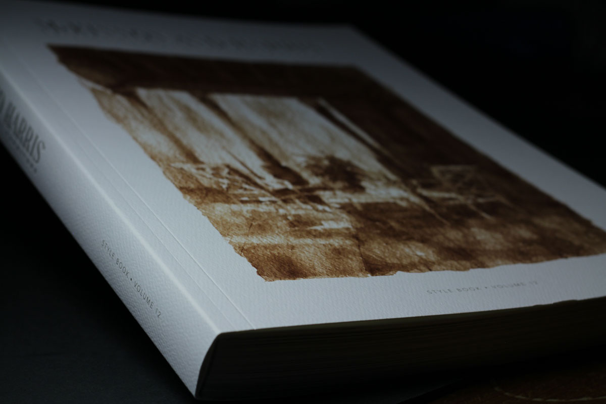
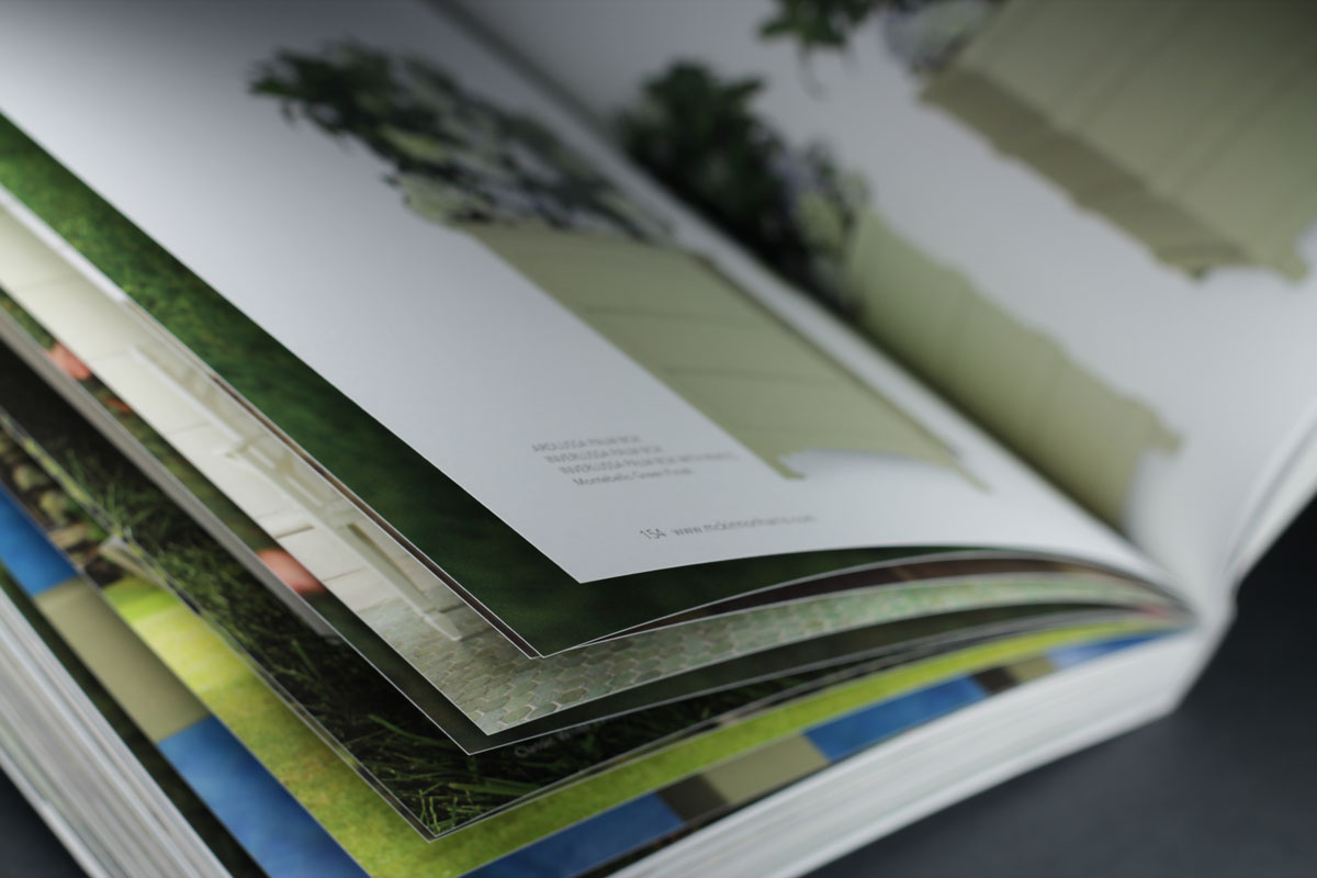
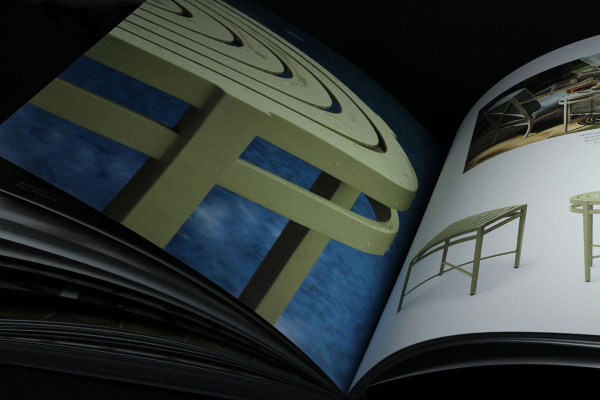
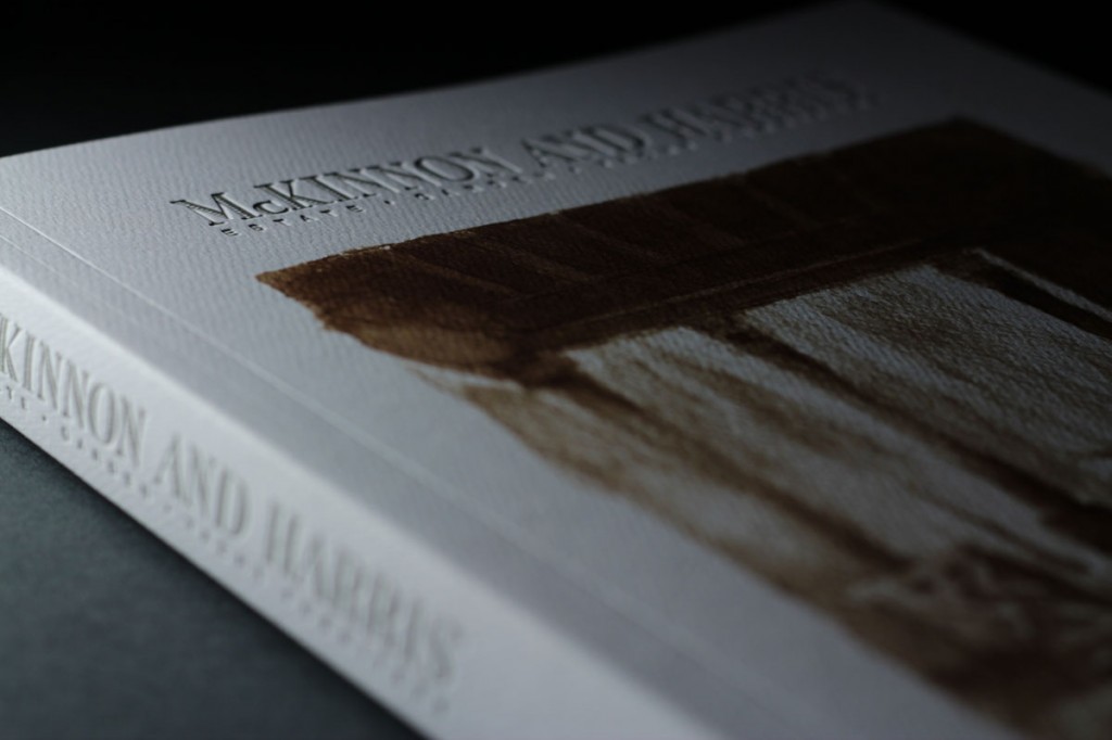
The high end garden furniture featured in this 2013 Style Book is all subtle pastels and soft neutrals. These are sensitive tones that would be dramatically impacted by the warm hue of the Mohawk Options true white 80# cover the client chose for the text. Critical color like that requires special attention to help insure that the printed piece and the product match in spite of the substrate’s color. We call that special attention fingerprinting. Yes, fingerprinting is not just for cops anymore.
Just as law enforcement uses fingerprinting to match a set of prints to a suspect, the printing industry uses it to match a printed sheet to the customer’s approved proof as closely as possible. In this case, fingerprinting means setting up optimized press curves specific to a particular paper. Once the press is fingerprinted, you can compare the proof to a test sheet to see if you have a match. The extra time and expense required is well spent to insure accurate results.
With this Style Book, the client selected a representative set of images, some four-color process, some black and white and the PMS grey used throughout the book for testing and we made a set of linear plates without curves as a baseline. After pulling press proofs of these plates, we created plate curves to control dot gain. Proofs made from this second set of plates were approved. Finally, a few photos were color corrected to reduce the yellowness of the products. End result: two sets of plates and some press time, an investment well worth making considering its vital importance to the end result.
During the production run, press sheets were approved on the first or second pull on all but one form. By fingerprinting the press to compensate for the particular whiteness of the stock, color in the catalog turns out both nuanced and lush. And, most importantly, the client is thrilled! Case closed.